The essence of this is that if your site is hard to use on a mobile phone, it will be listed poorly for people searching on their mobile phone.
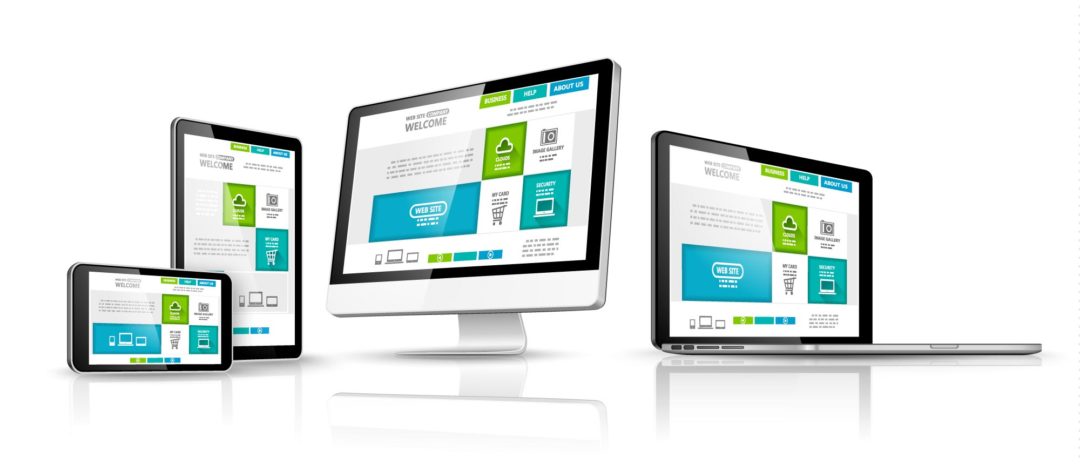
Here’s the context. In 2014 the developed countries of the world averaged a 25% increase in web traffic on mobile phones. That’s in just one year! For many years now, browsing on your mobile phone has been too difficult to endure. The fonts were small, you had to scroll horizontally, the connection was slow, certain functions didn’t work. So while people carried these devices at all times, they would opt for a tablet or a laptop to surf the internet if at all possible.
As developers started to adapt their sites to these smaller devices, people started to use them. Now the process is compounding.
The outcome is that for mobile users, some sites are still annoying and others aren’t. Google use these criteria to decide whether to send a mobile visitor to you or not:
- Your site must scale to fit the screen of mobile devices
- You site must require no horizontal scrolling (even in portrait orientation)
- Your site must use large fonts for mobile devices
- Your site’s buttons must be large enough to tap easily
- You site must achieve this without any third party scripting
For a long time now, I have been building sites that “work” on all devices, but these criteria are asking us for a bit more user-friendliness. No longer will scaling the site down and requiring the user to turn their phone over into landscape orientation, suffice. Google knows that people almost never turn their phone on its side. They want to browse with one thumb.
I have spent many hours researching and developing the best way to meet these criteria. The outcome for my own site is 4 different layouts where elements are not only scaled, but also repositioned as needed. If you have your phone on you, check it out https://www.flashme.com.au
Here is an actual screen capture of Google’s report on my site as it stands now: (click to enlarge)

If you care to read through the report you’ll see the criteria I listed above. The average mobile session duration on my site has gone from 38 seconds in January to over 2 minutes over the last 30 days. That’s proof right there. People who stay on your site for 2 minutes on their mobile phone are obviously not finding it annoying to navigate and read.
New sites:
All these technologies are built into every new site created. So you don’t need to worry about any of this. Instead just be confident that you will benefit from these developments
Existing Site Owners
No plugins or flash: – Unfortunately Google has also changed their behaviour with flash. Google used to ignore flash content if there was alternative content. So if your site had both a flash version and a javascript version, Google would only read and rate your javascript version. This would have meant that making the phone and tablet version of your site mobile-friendly would have been adequate. Now however, it seems that Google is indexing more and more flash content. So your flash content needs to fit the phone too, even though most phones show the non-flash content instead.
Google’s indexing of flash content is becoming problematic in other ways too. Especially for flash sites that load dynamic data like my old ones do. Here, what used to be a search advantage has been turned around on us.
At any rate, the time for flash is over.
- If you only have a flash version of your site, you are missing out on almost all mobile traffic – which is a huge chunk of your market.
- If you have both versions, it’s time for you to retire one and develop the other.
Google specifies that javascript cannot be used to re-scale or re-position your site either. Instead, media queries and CSS3 are the only acceptable technology. It’s a good thing that Google are contributing through these criteria to a standardisation of technologies, but for site owners, it now means upgrades.
For non-flash sites, the implementation of these new methods will range between $500 and $900* depending on how many and what type of modules it uses; Property maps and shops and the like all require a little more attention. Call us or write for a specific quote that meets your site’s requirements.